Exploratory Visual Analysis
Data Visualization
Prasanna Parasurama
Lifecycle of a data analysis project
Data acquisition
Provenance
- Is the source reliable?
- How was the data collected?
- When was it collected?
- What was the intent or motive?
Data understanding
- What does the dataset contain?
- What tables are available?
- What does each row represent?
- What data is missing?
- Are there erroneous values?
- Are the data types correct?
Data cleaning
- What should we do with missing data?
- Which data types need conversion?
- What should we do with erroneous values?
Exploratory analysis
- Explore variable distributions
- Explore relationships in the data
- Ask a question / generate a hypothesis
- Create charts to answer the question
- Ask a new question based on the chart ↻ Repeat
Formal statistical modeling
Findings
Communication and dissemination
Our case study: Applicant Tracking System (ATS) data
We will work with Applicant Tracking System (ATS) data from a real company.
- The ATS records all applications received by the company, information about each application, and the outcome of each application.
- The level of observation is the application: each row corresponds to a unique application.
- An applicant can submit multiple applications.
| Applications | Unique applicants | Jobs | Application dates |
|---|---|---|---|
| 25,450 | 16,999 | 403 | Jan 2016–Nov 2018 |
ATS data dictionary
| Field | Definition / values |
|---|---|
application_id |
Unique application identifier. |
applicant_id |
Unique applicant identifier; an applicant can have multiple applications. |
app_date |
Date of the application. |
job_id |
Unique job identifier. |
biz_unit |
Business unit of the job. |
gender |
Applicant gender: male, female. |
race |
Applicant race: white, black, asian, hispanic. |
yrs_exp |
Years of experience at the time of application. |
highest_degree |
bachelors, masters, doctorate, diploma, n/a. |
| Field | Definition / values |
|---|---|
field_of_study |
technical, business, law, other. |
school_rank |
top10, 11–20, 21–50, 51–100, 101–200, unranked. |
school_region |
Region of the applicant’s school. |
referral |
Referral from a current employee: 0 = no, 1 = yes. |
job_resume_fit |
Resume skills’ fit to the job description: 0 = no fit, 1 = perfect fit. |
callback |
Received a callback for this application: 0 = no, 1 = yes. |
interview |
Received an interview for this application: 0 = no, 1 = yes. |
offer |
Received an offer for this application: 0 = no, 1 = yes. |
hired |
Hired for this application: 0 = no, 1 = yes. |
What do we know about each application?
| Field group | Examples | Questions we can explore |
|---|---|---|
| Application and job | Application date, job, business unit | Where is application volume concentrated? |
| Applicant background | Experience, degree, field of study, school, gender, race | How does the applicant mix vary? |
| Application signals | Referral, job–resume fit (0–1) | How do these relate to progression? |
| Outcomes | Callback → interview → offer → hired | Where do applications leave the process? |
EDA for one variable
Describe the center, spread, and shape of a distribution.
Common EDA questions for 1 variable
Start by asking how the values of one field are distributed.
| Question | Summary | Visual |
|---|---|---|
| What is the central tendency? | Mean, median, mode | Bar chart, histogram |
| How are values spread? | Range, IQR, standard deviation | Box plot, histogram |
| What is the shape? | Skew, modes, tails | Histogram, density, ECDF |
Histograms visualize a distribution
Each bar counts applications in a one-year experience bin. Taller bars mean that experience level appears more often.
- Read years of experience on the x-axis and application counts on the y-axis. Look for peaks, spread, and tails.
A density curve smooths the histogram
A density curve smooths the experience distribution. Peaks show concentrations; area over an interval approximates its share.
- Height is density, not a count. The total area under the full curve is 1; smoothing can hide narrow peaks.
Mean: an estimate of central tendency
\(\bar{x}=\frac{1}{n}\sum_{i=1}^{n}x_i\). Add all experience values and divide by the number of applications.
An extreme value moves the mean
Most applications list substantially less experience than the maximum of 50 years.
Mean 10.62 (orange) · Median 9 (dashed teal)
Median: the middle ordered value
Half of applications have at most 9 years of experience; half have at least 9.
- Sort the observations from smallest to largest.
- Take the middle value, or average the two middle values when the count is even.
- The median is also the 50th percentile.
Mode: the most frequent value
- A distribution can have one mode, several modes, or no modes at all.
- A category mode describes the most common category, not a numerical center.
Which years of experience are most common?
The tallest one-year bar is at 5 years, the mode of the experience distribution.
Percentiles: positions in an ordered distribution
A percentile is a cut point in an ordered distribution. The 75th percentile has about 75% of observations at or below it.
Read from smallest to largest:
In ATS data, the 75th percentile is 14 years of experience.
Quartiles on the experience distribution
Quartiles divide ordered observations into four roughly equal parts: Q1 = 25th, Q2 = 50th (median), Q3 = 75th percentile.
Interquartile range
The IQR is the distance from the 25th to the 75th percentile.
\[\operatorname{IQR}=Q_3-Q_1=14-6=8\text{ years}\]
The middle half of ATS applications spans 6 to 14 years of experience.
Box plots summarize a distribution
The box marks Q1, median, and Q3; whiskers show a defined range, with extreme values shown separately.
Trimmed (or truncated) means
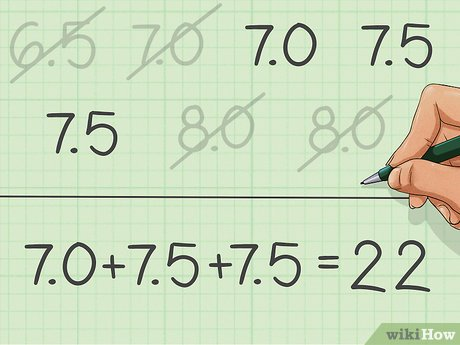
- In diving, the highest and lowest scores are dropped so that individual judges cannot significantly influence the score.
- Trimmed means can be thought of as a compromise between arithmetic means and medians.
Outliers are not automatically errors
The highest recorded experience is 50 years.
- It may describe a genuine applicant, a miscoded value, or a different definition of experience.
- Removing it solely because it is unusual would hide a data-quality question.
- Compare conclusions with and without extreme values, then document the decision.
Estimates of spread
Center does not tell us whether applications have similar or very different experience levels.
| Measure | Experience in ATS | What it captures |
|---|---|---|
| Range | 49 years | Maximum − minimum |
| IQR | 8 years | Width of middle half |
| Standard deviation | 6.67 years | Typical squared-deviation scale |
Range is the simplest spread estimate
Experience spans from 1 to 50 years across applications.
\[\operatorname{range}=\max(x)-\min(x)=50-1=49\text{ years}\]
The range depends on just two observations; it is sensitive to extremes.
Mean absolute deviation
Average how far observations lie from the mean, ignoring direction.
\[\operatorname{MAD}_{\bar{x}}=\frac{1}{n}\sum_{i=1}^{n}|x_i-\bar{x}|\]
For application experience, the mean absolute deviation is computed in years, the same unit as the original values.
Variance and standard deviation
Square deviations from the mean, average them, then take the square root to return to the original unit.
\[\operatorname{Var}(x)=\frac{1}{n}\sum_{i=1}^{n}(x_i-\bar{x})^2,\qquad \operatorname{SD}(x)=\sqrt{\operatorname{Var}(x)}\]
- Variance has units of years².
- Standard deviation has units of years.
- Here we describe the observed applications, so the denominator is \(n\).
Standard deviation on the experience distribution
Experience has mean 10.62 years and standard deviation 6.67 years. The outer lines mark one SD below and above the mean.
Estimates of shape
After center and spread, inspect the form of the distribution.
- Is it roughly symmetric or skewed?
- Does it have one peak or several?
- Are there long tails, gaps, or boundaries?
Skewness: the two tails need not match
The experience distribution has a longer right tail: a few applications report much more experience than most.
CDFs are useful to compare distributions
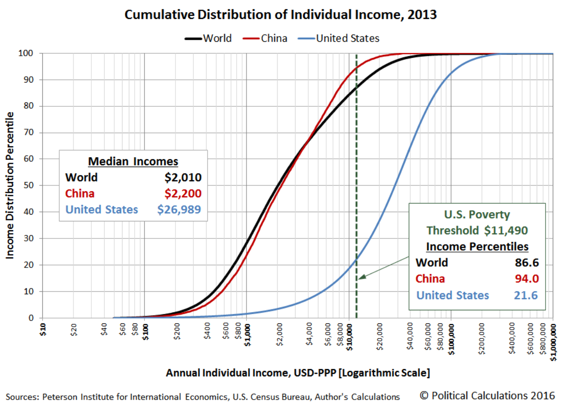
A cumulative distribution function (CDF) gives the share of observations at or below a value.
Read up from an income
What share has that income or less?
Read across from 50%
What is the median income?
The x-axis uses a logarithmic scale.
ECDFs compare fit scores across genders
At fit score x, each curve gives the share of applications with a fit score of x or less within that recorded gender.
EDA with two or more variables
Examine relationships and compare groups.
Choose a chart for the pair of variables
| Pair of variables | Question in ATS data | Example chart |
|---|---|---|
| Numeric + numeric | Does fit vary with experience? | 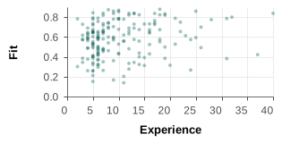 |
| Numeric + category | How does fit differ by unit? | 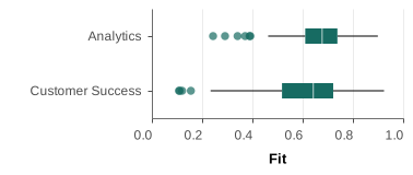 |
| Category + category | How does field-of-study mix vary by business unit? | 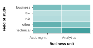 |
Scatter plots for numeric-numeric comparisons
Fit tends to rise with experience, but applications with the same experience have very different fit scores.
Look for clusters and boundaries
Grouping by business unit can reveal different clouds.
Small multiples of scatterplots
Separate panels make the experience–fit relationship easier to inspect within each unit.
Bubble size adds a third quantity
Each point is a business unit; its area indicates the number of valid-fit applications.
Pearson correlation summarizes a linear relationship
Experience and fit have Pearson correlation 0.227.
\[-1\leq r\leq 1\]
- Positive values describe an upward linear association.
- Values near 0 describe little linear association.
- One number does not show clusters, curves, or uneven spread.
Squared correlation has a narrower interpretation
For a simple linear fit of fit on experience, \(r^2\approx 0.051\).
\[r^2=(0.227)^2\approx 0.051\]
Experience alone accounts for about 5% of the observed variation in fit under this simple linear summary.
- This does not say experience causes 5% of fit, or that a richer model would perform similarly.
An observed relationship is not necessarily a causal effect
Applications with more experience tend to have higher fit, but the chart cannot identify why.
- Applicants select jobs; jobs require different experience.
- The resume-fit score may itself use experience-related inputs.
- The workbook does not describe the scoring process or application selection.
- Treat the pattern as a question for further study, not evidence that adding experience would change a score by a specific amount.
A scatterplot matrix checks several pairs
Change the observation to a job: compare application volume, mean experience, and mean fit across 403 jobs.
A correlation matrix is a compact summary
Summarize the same 403 jobs. Application volume and mean fit have a modest negative correlation (−0.24).
Correlation matrix: product subcategories
Heat map shows density in 2 dimensions
A two-dimensional count map reveals where many applications overlap in the scatterplot.
Numeric–category comparisons
For a numerical measure and a categorical field, compare full distributions before reducing each group to one number.
- Use box plots to compare center and spread.
- Use strips, violins, or small histograms to inspect shape.
- Use dots or dumbbells when the question is about one summary per group.
Box plots compare experience across units
The median and spread of experience differ across business units.
Strip plots retain individual observations
A strip plot shows the range and concentration that group summaries compress.
A violin plot shows distribution shape
A mirrored density curve shows each group’s shape. The horizontal lines mark its median fit score.
A butterfly chart compares two distributions
Compare job–resume fit for male and female applicants. Each bar shows the share within its recorded gender category.
Small histograms compare the eight largest units
Repeated axes reveal whether the fit distribution changes across units.
Dumbbell charts are useful to compare numerical values across 2 categories
Each line connects the rate for applications with a referral to the rate for applications without one.
Small multiples of bars for categorical combinations
Within each unit, compare application counts across fields of study on the same scale.
Compare composition with 100% stacked bars
Platform Engineering applications are concentrated in technical fields. Customer-facing units draw a broader mix.
A colored frequency table supports exact lookup
Use the same unit × field-of-study counts to see both group size and composition.
Lifecycle of a data analysis project
Data acquisition
Provenance
- Is the source reliable?
- How was the data collected?
- When was it collected?
- What was the intent or motive?
Data understanding
- What does the dataset contain?
- What tables are available?
- What does each row represent?
- What data is missing?
- Are there erroneous values?
- Are the data types correct?
Data cleaning
- What should we do with missing data?
- Which data types need conversion?
- What should we do with erroneous values?
Exploratory analysis
- Explore variable distributions
- Explore relationships in the data
- Ask a question / generate a hypothesis
- Create charts to answer the question
- Ask a new question based on the chart ↻ Repeat
Formal statistical modeling
Findings
Communication and dissemination
Compare composition with 100% stacked bars
Chart code
field_order = ["technical", "business", "law", "other", "n/a"]
field_unit["field_order"] = field_unit.field_of_study.map(
    {v: i for i, v in enumerate(field_order)}
)
finish(
    alt.Chart(field_unit)
    .mark_bar()
    .encode(
        y=alt.Y("biz_unit:N", title=None, sort=group_units),
        x=alt.X(
            "applications:Q",
            stack="normalize",
            title="Share of applications within business unit",
            axis=alt.Axis(format="%", labelAngle=0, tickCount=6),
        ),
        color=alt.Color(
            "field_of_study:N", title="Field of study", sort=field_order
        ),
        order=alt.Order("field_order:Q", sort="ascending"),
        tooltip=["biz_unit:N", "field_of_study:N", "applications:Q"],
    )
    .properties(width=800, height=390)
)
Data preparation and helpers
Use the ATS workbook and the shared course theme. These prerequisites come from the lecture source.
from pathlib import Path

import altair as alt

import pandas as pd

from shared.altair_theme import PRIMARY, SECONDARY, TABLEAU10, finish

applications = pd.read_excel(Path("../datasets/ats_data.xlsx"))

unit_counts = (
    applications.groupby("biz_unit", as_index=False)
    .size()
    .rename(columns={"size": "applications"})
    .sort_values("applications", ascending=False)
)

group_units = unit_counts.head(8).biz_unit.tolist()

field_unit = (
    applications.loc[applications.biz_unit.isin(group_units)]
    .assign(field_of_study=lambda d: d["field_of_study"].fillna("n/a"))
    .groupby(["biz_unit", "field_of_study"], as_index=False)
    .size()
    .rename(columns={"size": "applications"})
)

field_unit = (
    field_unit.set_index(["biz_unit", "field_of_study"])
    .reindex(
        pd.MultiIndex.from_product(
            [group_units, ["technical", "business", "law", "other", "n/a"]],
            names=["biz_unit", "field_of_study"],
        ),
        fill_value=0,
    )
    .reset_index()
)
Numeric + category
Chart code
mini_box = (
    alt.Chart(
        scatter_sample.loc[
            scatter_sample.biz_unit.isin(["Analytics", "Customer Success"])
        ]
    )
    .mark_boxplot()
    .encode(
        x=alt.X("job_resume_fit:Q", title="Fit"),
        y=alt.Y("biz_unit:N", title=None),
    )
    .properties(width=230, height=100)
)
finish(mini_box)
Data preparation and helpers
Use the ATS workbook and the shared course theme. These prerequisites come from the lecture source.
from pathlib import Path

import altair as alt

import pandas as pd

from shared.altair_theme import PRIMARY, SECONDARY, TABLEAU10, finish

applications = pd.read_excel(Path("../datasets/ats_data.xlsx"))

fit_valid = applications.loc[
    applications["job_resume_fit"].between(0, 1)
].copy()

scatter_sample = fit_valid.sample(n=1800, random_state=675)[
    ["yrs_exp", "job_resume_fit", "biz_unit"]
].copy()
A colored frequency table supports exact lookup
Chart code
field_heat = (
    alt.Chart(field_unit)
    .mark_rect()
    .encode(
        x=alt.X(
            "field_of_study:N",
            title="Field of study",
            sort=field_order,
            axis=alt.Axis(labelAngle=0),
        ),
        y=alt.Y("biz_unit:N", title=None, sort=group_units),
        color=alt.Color(
            "applications:Q",
            title="Applications",
            scale=alt.Scale(scheme="teals"),
        ),
    )
)
field_text = field_heat.mark_text(fontSize=17).encode(
    text=alt.Text("applications:Q", format=","),
    color=alt.condition(
        alt.datum.applications > 2000, alt.value("white"), alt.value("black")
    ),
)
finish((field_heat + field_text).properties(width=700, height=350))
Data preparation and helpers
Use the ATS workbook and the shared course theme. These prerequisites come from the lecture source.
from pathlib import Path

import altair as alt

import pandas as pd

from shared.altair_theme import PRIMARY, SECONDARY, TABLEAU10, finish

applications = pd.read_excel(Path("../datasets/ats_data.xlsx"))

unit_counts = (
    applications.groupby("biz_unit", as_index=False)
    .size()
    .rename(columns={"size": "applications"})
    .sort_values("applications", ascending=False)
)

group_units = unit_counts.head(8).biz_unit.tolist()

field_unit = (
    applications.loc[applications.biz_unit.isin(group_units)]
    .assign(field_of_study=lambda d: d["field_of_study"].fillna("n/a"))
    .groupby(["biz_unit", "field_of_study"], as_index=False)
    .size()
    .rename(columns={"size": "applications"})
)

field_unit = (
    field_unit.set_index(["biz_unit", "field_of_study"])
    .reindex(
        pd.MultiIndex.from_product(
            [group_units, ["technical", "business", "law", "other", "n/a"]],
            names=["biz_unit", "field_of_study"],
        ),
        fill_value=0,
    )
    .reset_index()
)

field_order = ["technical", "business", "law", "other", "n/a"]

field_unit["field_order"] = field_unit.field_of_study.map(
    {v: i for i, v in enumerate(field_order)}
)
Standard deviation on the experience distribution
Chart code
def experience_histogram():
    return (
        alt.Chart(exp_counts)
        .mark_bar(orient="vertical", stroke="white", strokeWidth=0.6)
        .encode(
            x=alt.X(
                "start:Q",
                title="Years of experience",
                scale=alt.Scale(domain=[0, 51], nice=False),
                axis=alt.Axis(labelAngle=0, tickCount=11),
            ),
            x2="end:Q",
            y=alt.Y(
                "applications:Q",
                title="Applications",
                scale=alt.Scale(domain=[0, 2800], nice=False),
            ),
            y2=alt.datum(0),
            tooltip=[
                alt.Tooltip("yrs_exp:Q", title="Years of experience"),
                alt.Tooltip("applications:Q", title="Applications", format=","),
            ],
        )
    )


sd_boundaries = pd.DataFrame(
    {
        "years": [exp_mean - exp_std, exp_mean, exp_mean + exp_std],
        "label": [
            f"−1 SD: {exp_mean-exp_std:.2f}",
            f"Mean: {exp_mean:.2f}",
            f"+1 SD: {exp_mean+exp_std:.2f}",
        ],
    }
)
sd_lines = (
    alt.Chart(sd_boundaries)
    .mark_rule(color=SECONDARY, strokeWidth=2)
    .encode(x="years:Q")
)
sd_labels = (
    alt.Chart(sd_boundaries)
    .mark_text(align="left", dx=4, dy=-8, color=SECONDARY, fontSize=13)
    .encode(x="years:Q", y=alt.value(0), text="label:N")
)
finish(
    (experience_histogram() + sd_lines + sd_labels).properties(
        width=900, height=350
    )
)
Data preparation and helpers
Use the ATS workbook and the shared course theme. These prerequisites come from the lecture source.
from pathlib import Path

import altair as alt

import pandas as pd

from shared.altair_theme import PRIMARY, SECONDARY, TABLEAU10, finish

applications = pd.read_excel(Path("../datasets/ats_data.xlsx"))

exp_counts = (
    applications.groupby("yrs_exp", as_index=False)
    .size()
    .rename(columns={"size": "applications"})
)

exp_counts = (
    exp_counts.set_index("yrs_exp")
    .reindex(range(1, 51), fill_value=0)
    .rename_axis("yrs_exp")
    .reset_index()
)

exp_counts["start"] = exp_counts.yrs_exp - 0.5

exp_counts["end"] = exp_counts.yrs_exp + 0.5

exp_mean = applications["yrs_exp"].mean()

exp_std = applications["yrs_exp"].std(ddof=0)
Look for clusters and boundaries
Chart code
cluster_sample = scatter_sample.loc[
    scatter_sample["biz_unit"].isin(
        ["Account Management", "Platform Engineering"]
    )
]
finish(
    alt.Chart(cluster_sample)
    .mark_circle(size=36, opacity=0.30)
    .encode(
        x=alt.X(
            "yrs_exp:Q",
            title="Years of experience",
            scale=alt.Scale(domain=[0, 51], nice=False),
            axis=alt.Axis(labelAngle=0, tickCount=10),
        ),
        y=alt.Y(
            "job_resume_fit:Q",
            title="Job–resume fit",
            scale=alt.Scale(domain=[0, 1]),
        ),
        color=alt.Color("biz_unit:N", title="Business unit"),
    )
    .properties(width=820, height=355)
)
Data preparation and helpers
Use the ATS workbook and the shared course theme. These prerequisites come from the lecture source.
from pathlib import Path

import altair as alt

import pandas as pd

from shared.altair_theme import PRIMARY, SECONDARY, TABLEAU10, finish

applications = pd.read_excel(Path("../datasets/ats_data.xlsx"))

fit_valid = applications.loc[
    applications["job_resume_fit"].between(0, 1)
].copy()

scatter_sample = fit_valid.sample(n=1800, random_state=675)[
    ["yrs_exp", "job_resume_fit", "biz_unit"]
].copy()
Mean: an estimate of central tendency
Chart code
def experience_histogram():
    return (
        alt.Chart(exp_counts)
        .mark_bar(orient="vertical", stroke="white", strokeWidth=0.6)
        .encode(
            x=alt.X(
                "start:Q",
                title="Years of experience",
                scale=alt.Scale(domain=[0, 51], nice=False),
                axis=alt.Axis(labelAngle=0, tickCount=11),
            ),
            x2="end:Q",
            y=alt.Y(
                "applications:Q",
                title="Applications",
                scale=alt.Scale(domain=[0, 2800], nice=False),
            ),
            y2=alt.datum(0),
            tooltip=[
                alt.Tooltip("yrs_exp:Q", title="Years of experience"),
                alt.Tooltip("applications:Q", title="Applications", format=","),
            ],
        )
    )


mean_rule = (
    alt.Chart(pd.DataFrame({"years": [exp_mean]}))
    .mark_rule(color=SECONDARY, strokeWidth=3)
    .encode(x="years:Q")
)
mean_label = (
    alt.Chart(
        pd.DataFrame(
            {"years": [exp_mean], "label": [f"Mean: {exp_mean:.2f} years"]}
        )
    )
    .mark_text(align="left", dx=7, dy=12, color=SECONDARY, fontSize=15)
    .encode(x="years:Q", y=alt.value(0), text="label:N")
)
finish(
    (experience_histogram() + mean_rule + mean_label).properties(
        width=900, height=350
    )
)
Data preparation and helpers
Use the ATS workbook and the shared course theme. These prerequisites come from the lecture source.
from pathlib import Path

import altair as alt

import pandas as pd

from shared.altair_theme import PRIMARY, SECONDARY, TABLEAU10, finish

applications = pd.read_excel(Path("../datasets/ats_data.xlsx"))

exp_counts = (
    applications.groupby("yrs_exp", as_index=False)
    .size()
    .rename(columns={"size": "applications"})
)

exp_counts = (
    exp_counts.set_index("yrs_exp")
    .reindex(range(1, 51), fill_value=0)
    .rename_axis("yrs_exp")
    .reset_index()
)

exp_counts["start"] = exp_counts.yrs_exp - 0.5

exp_counts["end"] = exp_counts.yrs_exp + 0.5

exp_mean = applications["yrs_exp"].mean()
Box plots compare experience across units
Chart code
box_units = applications.loc[
    applications.biz_unit.isin(group_units), ["biz_unit", "yrs_exp"]
].sample(n=1800, random_state=675)
finish(
    alt.Chart(box_units)
    .mark_boxplot(extent=1.5)
    .encode(
        x=alt.X("yrs_exp:Q", title="Years of experience"),
        y=alt.Y("biz_unit:N", title=None, sort=group_units),
    )
    .properties(width=820, height=390)
)
Data preparation and helpers
Use the ATS workbook and the shared course theme. These prerequisites come from the lecture source.
from pathlib import Path

import altair as alt

import pandas as pd

from shared.altair_theme import PRIMARY, SECONDARY, TABLEAU10, finish

applications = pd.read_excel(Path("../datasets/ats_data.xlsx"))

unit_counts = (
    applications.groupby("biz_unit", as_index=False)
    .size()
    .rename(columns={"size": "applications"})
    .sort_values("applications", ascending=False)
)

group_units = unit_counts.head(8).biz_unit.tolist()
Small histograms compare the eight largest units
Chart code
unit_histograms = pd.concat(
    [
        pd.DataFrame(
            {
                "fit_start": fit_edges[:-1],
                "fit_end": fit_edges[1:],
                "share": np.histogram(group["job_resume_fit"], bins=fit_edges)[
                    0
                ]
                / len(group),
                "biz_unit": unit,
            }
        )
        for unit, group in fit_valid.loc[
            fit_valid.biz_unit.isin(group_units)
        ].groupby("biz_unit")
    ],
    ignore_index=True,
)
unit_hist = (
    alt.Chart(unit_histograms)
    .mark_bar(orient="vertical", stroke="white", strokeWidth=0.6)
    .encode(
        x=alt.X(
            "fit_start:Q",
            title="Fit",
            scale=alt.Scale(domain=[0, 1], nice=False),
            axis=alt.Axis(labelAngle=0, values=[0, 0.5, 1]),
        ),
        x2="fit_end:Q",
        y2=alt.datum(0),
        y=alt.Y(
            "share:Q", title="Share", axis=alt.Axis(format="%", tickCount=3)
        ),
    )
    .properties(width=220, height=165)
    .facet(
        facet=alt.Facet(
            "biz_unit:N",
            title=None,
            sort=group_units,
            header=alt.Header(labelFontSize=12, labelLimit=240),
        ),
        columns=4,
        spacing=14,
    )
)
finish(unit_hist)
Data preparation and helpers
Use the ATS workbook and the shared course theme. These prerequisites come from the lecture source.
from pathlib import Path

import altair as alt

import numpy as np

import pandas as pd

from shared.altair_theme import PRIMARY, SECONDARY, TABLEAU10, finish

applications = pd.read_excel(Path("../datasets/ats_data.xlsx"))

fit_valid = applications.loc[
    applications["job_resume_fit"].between(0, 1)
].copy()

unit_counts = (
    applications.groupby("biz_unit", as_index=False)
    .size()
    .rename(columns={"size": "applications"})
    .sort_values("applications", ascending=False)
)

fit_edges = np.linspace(0, 1, 21)

group_units = unit_counts.head(8).biz_unit.tolist()
Skewness: the two tails need not match
Chart code
def experience_histogram():
    return (
        alt.Chart(exp_counts)
        .mark_bar(orient="vertical", stroke="white", strokeWidth=0.6)
        .encode(
            x=alt.X(
                "start:Q",
                title="Years of experience",
                scale=alt.Scale(domain=[0, 51], nice=False),
                axis=alt.Axis(labelAngle=0, tickCount=11),
            ),
            x2="end:Q",
            y=alt.Y(
                "applications:Q",
                title="Applications",
                scale=alt.Scale(domain=[0, 2800], nice=False),
            ),
            y2=alt.datum(0),
            tooltip=[
                alt.Tooltip("yrs_exp:Q", title="Years of experience"),
                alt.Tooltip("applications:Q", title="Applications", format=","),
            ],
        )
    )


finish(experience_histogram().properties(width=900, height=350))
Data preparation and helpers
Use the ATS workbook and the shared course theme. These prerequisites come from the lecture source.
from pathlib import Path

import altair as alt

import pandas as pd

from shared.altair_theme import PRIMARY, SECONDARY, TABLEAU10, finish

applications = pd.read_excel(Path("../datasets/ats_data.xlsx"))

exp_counts = (
    applications.groupby("yrs_exp", as_index=False)
    .size()
    .rename(columns={"size": "applications"})
)

exp_counts = (
    exp_counts.set_index("yrs_exp")
    .reindex(range(1, 51), fill_value=0)
    .rename_axis("yrs_exp")
    .reset_index()
)

exp_counts["start"] = exp_counts.yrs_exp - 0.5

exp_counts["end"] = exp_counts.yrs_exp + 0.5
Dumbbell charts are useful to compare numerical values across 2 categories
Chart code
referral_domain = ["No referral", "Referral"]
referral_colors = alt.Scale(
    domain=referral_domain, range=[TABLEAU10[0], TABLEAU10[1]]
)


def referral_dumbbell(long, category, order, axis_title, width, height):
    wide = long.pivot(
        index=category, columns="group", values="rate"
    ).reset_index()
    y = alt.Y(
        f"{category}:N", title=None, sort=order, axis=alt.Axis(labelLimit=210)
    )
    x = alt.X(
        "No referral:Q",
        title=axis_title,
        scale=alt.Scale(domain=[0, 0.85]),
        axis=alt.Axis(format="%", labelAngle=0, tickCount=5),
    )
    rules = (
        alt.Chart(wide)
        .mark_rule(color="gray", strokeWidth=2)
        .encode(y=y, x=x, x2="Referral:Q")
    )
    dots = (
        alt.Chart(long)
        .mark_circle(size=90, opacity=1)
        .encode(
            y=y,
            x=alt.X(
                "rate:Q",
                title=axis_title,
                scale=alt.Scale(domain=[0, 0.85]),
                axis=alt.Axis(format="%", labelAngle=0, tickCount=5),
            ),
            color=alt.Color("group:N", title=None, scale=referral_colors),
            tooltip=[
                f"{category}:N",
                "group:N",
                alt.Tooltip("rate:Q", format=".1%"),
            ]
            + (
                [alt.Tooltip("n:Q", title="Applications")]
                if "n" in long.columns
                else []
            ),
        )
    )
    return (rules + dots).properties(width=width, height=height)


selected_units = group_units
dumbbell_long = unit_referral.loc[
    unit_referral.biz_unit.isin(selected_units)
].copy()
stage_dumbbell = referral_dumbbell(
    referral_stages, "stage", stage_order, "Share reaching each stage", 215, 350
).properties(title="Progress through hiring")
unit_dumbbell = referral_dumbbell(
    dumbbell_long, "biz_unit", selected_units, "Callback rate", 215, 350
).properties(title="Within the eight largest units")
fit_dumbbell = referral_dumbbell(
    fit_referral,
    "band",
    ["0–0.2", "0.2–0.4", "0.4–0.6", "0.6–0.8", "0.8–1.0"],
    "Callback rate",
    215,
    350,
).properties(title="Within fit bands")
finish(
    alt.hconcat(
        stage_dumbbell, unit_dumbbell, fit_dumbbell, spacing=24
    ).resolve_scale(color="shared")
)
Data preparation and helpers
Use the ATS workbook and the shared course theme. These prerequisites come from the lecture source.
from pathlib import Path

import altair as alt

import pandas as pd

from shared.altair_theme import PRIMARY, SECONDARY, TABLEAU10, finish

applications = pd.read_excel(Path("../datasets/ats_data.xlsx"))

fit_valid = applications.loc[
    applications["job_resume_fit"].between(0, 1)
].copy()

unit_counts = (
    applications.groupby("biz_unit", as_index=False)
    .size()
    .rename(columns={"size": "applications"})
    .sort_values("applications", ascending=False)
)

group_units = unit_counts.head(8).biz_unit.tolist()

referral_labels = {0: "No referral", 1: "Referral"}

stage_order = ["Callback", "Interview", "Offer", "Hired"]

referral_stages = (
    applications.groupby("referral")[
        ["callback", "interview", "offer", "hired"]
    ]
    .mean()
    .reset_index()
    .melt(id_vars="referral", var_name="stage", value_name="rate")
)

referral_stages["stage"] = referral_stages.stage.str.title()

referral_stages["group"] = referral_stages.referral.map(referral_labels)

unit_referral = applications.groupby(
    ["biz_unit", "referral"], as_index=False
).agg(n=("callback", "size"), rate=("callback", "mean"))

unit_referral["group"] = unit_referral.referral.map(referral_labels)

fit_referral = (
    fit_valid.assign(
        band=pd.cut(
            fit_valid.job_resume_fit,
            [0, 0.2, 0.4, 0.6, 0.8, 1],
            labels=["0–0.2", "0.2–0.4", "0.4–0.6", "0.6–0.8", "0.8–1.0"],
            include_lowest=True,
        )
    )
    .groupby(["band", "referral"], observed=True)
    .agg(n=("callback", "size"), rate=("callback", "mean"))
    .reset_index()
)

fit_referral["band"] = fit_referral.band.astype(str)

fit_referral["group"] = fit_referral.referral.map(referral_labels)
Small multiples of bars for categorical combinations
Chart code
field_bars = (
    alt.Chart(field_unit)
    .mark_bar()
    .encode(
        y=alt.Y(
            "field_of_study:N",
            title=None,
            sort=["technical", "business", "law", "other", "n/a"],
        ),
        color=alt.Color(
            "field_of_study:N",
            title="Field of study",
            scale=alt.Scale(
                domain=["technical", "business", "law", "other", "n/a"],
                range=list(TABLEAU10[:5]),
            ),
        ),
        x=alt.X(
            "applications:Q",
            title="Applications",
            scale=alt.Scale(domain=[0, 4500]),
            axis=alt.Axis(values=[0, 2000, 4000], format="~s", labelAngle=0),
        ),
    )
    .properties(width=190, height=150)
    .facet(
        facet=alt.Facet(
            "biz_unit:N",
            title=None,
            sort=group_units,
            header=alt.Header(labelFontSize=12, labelLimit=240),
        ),
        columns=4,
        spacing=14,
    )
)
finish(field_bars)
Data preparation and helpers
Use the ATS workbook and the shared course theme. These prerequisites come from the lecture source.
from pathlib import Path

import altair as alt

import pandas as pd

from shared.altair_theme import PRIMARY, SECONDARY, TABLEAU10, finish

applications = pd.read_excel(Path("../datasets/ats_data.xlsx"))

unit_counts = (
    applications.groupby("biz_unit", as_index=False)
    .size()
    .rename(columns={"size": "applications"})
    .sort_values("applications", ascending=False)
)

group_units = unit_counts.head(8).biz_unit.tolist()

field_unit = (
    applications.loc[applications.biz_unit.isin(group_units)]
    .assign(field_of_study=lambda d: d["field_of_study"].fillna("n/a"))
    .groupby(["biz_unit", "field_of_study"], as_index=False)
    .size()
    .rename(columns={"size": "applications"})
)

field_unit = (
    field_unit.set_index(["biz_unit", "field_of_study"])
    .reindex(
        pd.MultiIndex.from_product(
            [group_units, ["technical", "business", "law", "other", "n/a"]],
            names=["biz_unit", "field_of_study"],
        ),
        fill_value=0,
    )
    .reset_index()
)
Quartiles on the experience distribution
Chart code
def experience_histogram():
    return (
        alt.Chart(exp_counts)
        .mark_bar(orient="vertical", stroke="white", strokeWidth=0.6)
        .encode(
            x=alt.X(
                "start:Q",
                title="Years of experience",
                scale=alt.Scale(domain=[0, 51], nice=False),
                axis=alt.Axis(labelAngle=0, tickCount=11),
            ),
            x2="end:Q",
            y=alt.Y(
                "applications:Q",
                title="Applications",
                scale=alt.Scale(domain=[0, 2800], nice=False),
            ),
            y2=alt.datum(0),
            tooltip=[
                alt.Tooltip("yrs_exp:Q", title="Years of experience"),
                alt.Tooltip("applications:Q", title="Applications", format=","),
            ],
        )
    )


q_lines = pd.DataFrame(
    {
        "years": [exp_q1, exp_median, exp_q3],
        "quartile": ["Q1: 6", "Q2: 9", "Q3: 14"],
    }
)
bars = experience_histogram()
lines = (
    alt.Chart(q_lines)
    .mark_rule(strokeWidth=3, color=SECONDARY)
    .encode(x="years:Q")
)
labels = (
    alt.Chart(q_lines)
    .mark_text(align="left", dx=4, dy=-7, color=SECONDARY)
    .encode(x="years:Q", y=alt.value(0), text="quartile:N")
)
finish((bars + lines + labels).properties(width=900, height=350))
Data preparation and helpers
Use the ATS workbook and the shared course theme. These prerequisites come from the lecture source.
from pathlib import Path

import altair as alt

import pandas as pd

from shared.altair_theme import PRIMARY, SECONDARY, TABLEAU10, finish

applications = pd.read_excel(Path("../datasets/ats_data.xlsx"))

exp_counts = (
    applications.groupby("yrs_exp", as_index=False)
    .size()
    .rename(columns={"size": "applications"})
)

exp_counts = (
    exp_counts.set_index("yrs_exp")
    .reindex(range(1, 51), fill_value=0)
    .rename_axis("yrs_exp")
    .reset_index()
)

exp_counts["start"] = exp_counts.yrs_exp - 0.5

exp_counts["end"] = exp_counts.yrs_exp + 0.5

exp_median = applications["yrs_exp"].median()

exp_q1, exp_q3 = applications["yrs_exp"].quantile([0.25, 0.75])
An extreme value moves the mean
Chart code
def experience_histogram():
    return (
        alt.Chart(exp_counts)
        .mark_bar(orient="vertical", stroke="white", strokeWidth=0.6)
        .encode(
            x=alt.X(
                "start:Q",
                title="Years of experience",
                scale=alt.Scale(domain=[0, 51], nice=False),
                axis=alt.Axis(labelAngle=0, tickCount=11),
            ),
            x2="end:Q",
            y=alt.Y(
                "applications:Q",
                title="Applications",
                scale=alt.Scale(domain=[0, 2800], nice=False),
            ),
            y2=alt.datum(0),
            tooltip=[
                alt.Tooltip("yrs_exp:Q", title="Years of experience"),
                alt.Tooltip("applications:Q", title="Applications", format=","),
            ],
        )
    )


base = experience_histogram()
mean_line = (
    alt.Chart(pd.DataFrame({"x": [exp_mean]}))
    .mark_rule(color=SECONDARY, strokeWidth=3)
    .encode(x="x:Q")
)
median_line = (
    alt.Chart(pd.DataFrame({"x": [exp_median]}))
    .mark_rule(color=PRIMARY, strokeDash=[6, 4], strokeWidth=3)
    .encode(x="x:Q")
)
finish((base + mean_line + median_line).properties(width=900, height=350))
Data preparation and helpers
Use the ATS workbook and the shared course theme. These prerequisites come from the lecture source.
from pathlib import Path

import altair as alt

import pandas as pd

from shared.altair_theme import PRIMARY, SECONDARY, TABLEAU10, finish

applications = pd.read_excel(Path("../datasets/ats_data.xlsx"))

exp_counts = (
    applications.groupby("yrs_exp", as_index=False)
    .size()
    .rename(columns={"size": "applications"})
)

exp_counts = (
    exp_counts.set_index("yrs_exp")
    .reindex(range(1, 51), fill_value=0)
    .rename_axis("yrs_exp")
    .reset_index()
)

exp_counts["start"] = exp_counts.yrs_exp - 0.5

exp_counts["end"] = exp_counts.yrs_exp + 0.5

exp_mean = applications["yrs_exp"].mean()

exp_median = applications["yrs_exp"].median()
Scatter plots for numeric-numeric comparisons
Chart code
points = (
    alt.Chart(scatter_sample)
    .mark_circle(size=34, opacity=0.26)
    .encode(
        x=alt.X(
            "yrs_exp:Q",
            title="Years of experience",
            scale=alt.Scale(domain=[0, 51], nice=False),
            axis=alt.Axis(labelAngle=0, tickCount=10),
        ),
        y=alt.Y(
            "job_resume_fit:Q",
            title="Job–resume fit",
            scale=alt.Scale(domain=[0, 1]),
        ),
    )
)
fit_line = (
    alt.Chart(scatter_sample)
    .transform_regression("yrs_exp", "job_resume_fit")
    .mark_line(color=SECONDARY, strokeWidth=3)
    .encode(x="yrs_exp:Q", y="job_resume_fit:Q")
)
finish((points + fit_line).properties(width=850, height=365))
Data preparation and helpers
Use the ATS workbook and the shared course theme. These prerequisites come from the lecture source.
from pathlib import Path

import altair as alt

import pandas as pd

from shared.altair_theme import PRIMARY, SECONDARY, TABLEAU10, finish

applications = pd.read_excel(Path("../datasets/ats_data.xlsx"))

fit_valid = applications.loc[
    applications["job_resume_fit"].between(0, 1)
].copy()

scatter_sample = fit_valid.sample(n=1800, random_state=675)[
    ["yrs_exp", "job_resume_fit", "biz_unit"]
].copy()
A butterfly chart compares two distributions
Chart code
butterfly = gender_fit_hist.copy()
butterfly["Fit interval"] = [
    f"{fit_edges[i]:.2f}–{fit_edges[i+1]:.2f}" for i in range(20)
] * 2
fit_interval_order = [
    f"{fit_edges[i]:.2f}–{fit_edges[i+1]:.2f}" for i in range(20)
]
butterfly["signed_share"] = np.where(
    butterfly.gender.eq("male"), -butterfly.share, butterfly.share
)
butterfly_limit = np.ceil(butterfly.share.max() / 0.02) * 0.02
finish(
    alt.Chart(butterfly)
    .mark_bar()
    .encode(
        y=alt.Y(
            "Fit interval:O", title="Job–resume fit", sort=fit_interval_order
        ),
        x=alt.X(
            "signed_share:Q",
            title="Share within gender · Male ← | → Female",
            scale=alt.Scale(domain=[-butterfly_limit, butterfly_limit]),
            axis=alt.Axis(
                labelExpr="format(abs(datum.value), '.0%')",
                labelAngle=0,
                tickCount=7,
            ),
        ),
        color=alt.Color(
            "gender:N",
            title="Recorded gender",
            scale=alt.Scale(
                domain=["female", "male"], range=list(TABLEAU10[:2])
            ),
        ),
        tooltip=[
            "gender:N",
            "Fit interval:O",
            alt.Tooltip("share:Q", format=".1%"),
        ],
    )
    .properties(width=830, height=390)
)
Data preparation and helpers
Use the ATS workbook and the shared course theme. These prerequisites come from the lecture source.
from pathlib import Path

import altair as alt

import numpy as np

import pandas as pd

from shared.altair_theme import PRIMARY, SECONDARY, TABLEAU10, finish

applications = pd.read_excel(Path("../datasets/ats_data.xlsx"))

fit_valid = applications.loc[
    applications["job_resume_fit"].between(0, 1)
].copy()

fit_edges = np.linspace(0, 1, 21)

gender_fit_hist = pd.concat(
    [
        pd.DataFrame(
            {
                "fit_mid": (fit_edges[:-1] + fit_edges[1:]) / 2,
                "share": np.histogram(group["job_resume_fit"], bins=fit_edges)[
                    0
                ]
                / len(group),
                "gender": gender,
            }
        )
        for gender, group in fit_valid.groupby("gender")
    ],
    ignore_index=True,
)

gender_fit_hist["fit_mid_label"] = gender_fit_hist["fit_mid"].map(
    lambda value: f"{value:.2f}"
)
Small multiples of scatterplots
Chart code
faceted_sample = scatter_sample.loc[scatter_sample.biz_unit.isin(group_units)]
small_scatter = (
    alt.Chart(faceted_sample)
    .mark_circle(size=15, opacity=0.3)
    .encode(
        x=alt.X(
            "yrs_exp:Q",
            title="Experience",
            scale=alt.Scale(domain=[0, 51], nice=False),
            axis=alt.Axis(labelAngle=0, values=[0, 25, 50]),
        ),
        y=alt.Y(
            "job_resume_fit:Q",
            title="Fit",
            scale=alt.Scale(domain=[0, 1]),
            axis=alt.Axis(values=[0, 0.5, 1]),
        ),
    )
    .properties(width=220, height=165)
    .facet(
        facet=alt.Facet(
            "biz_unit:N",
            title=None,
            sort=group_units,
            header=alt.Header(labelFontSize=12, labelLimit=240),
        ),
        columns=4,
        spacing=14,
    )
)
finish(small_scatter)
Data preparation and helpers
Use the ATS workbook and the shared course theme. These prerequisites come from the lecture source.
from pathlib import Path

import altair as alt

import pandas as pd

from shared.altair_theme import PRIMARY, SECONDARY, TABLEAU10, finish

applications = pd.read_excel(Path("../datasets/ats_data.xlsx"))

fit_valid = applications.loc[
    applications["job_resume_fit"].between(0, 1)
].copy()

scatter_sample = fit_valid.sample(n=1800, random_state=675)[
    ["yrs_exp", "job_resume_fit", "biz_unit"]
].copy()

unit_counts = (
    applications.groupby("biz_unit", as_index=False)
    .size()
    .rename(columns={"size": "applications"})
    .sort_values("applications", ascending=False)
)

group_units = unit_counts.head(8).biz_unit.tolist()
Numeric + numeric
Chart code
mini_scatter = (
    alt.Chart(scatter_sample.sample(n=180, random_state=5))
    .mark_circle(size=15, opacity=0.4)
    .encode(
        x=alt.X("yrs_exp:Q", title="Experience"),
        y=alt.Y("job_resume_fit:Q", title="Fit"),
    )
    .properties(width=230, height=100)
)
finish(mini_scatter)
Data preparation and helpers
Use the ATS workbook and the shared course theme. These prerequisites come from the lecture source.
from pathlib import Path

import altair as alt

import pandas as pd

from shared.altair_theme import PRIMARY, SECONDARY, TABLEAU10, finish

applications = pd.read_excel(Path("../datasets/ats_data.xlsx"))

fit_valid = applications.loc[
    applications["job_resume_fit"].between(0, 1)
].copy()

scatter_sample = fit_valid.sample(n=1800, random_state=675)[
    ["yrs_exp", "job_resume_fit", "biz_unit"]
].copy()
Strip plots retain individual observations
Chart code
strip_sample = scatter_sample.loc[
    scatter_sample.biz_unit.isin(group_units)
].sample(n=700, random_state=677)
finish(
    alt.Chart(strip_sample)
    .mark_tick(size=15, thickness=1.5, opacity=0.3)
    .encode(
        x=alt.X(
            "job_resume_fit:Q",
            title="Job–resume fit",
            scale=alt.Scale(domain=[0, 1]),
        ),
        y=alt.Y("biz_unit:N", title=None, sort=group_units),
    )
    .properties(width=830, height=390)
)
Data preparation and helpers
Use the ATS workbook and the shared course theme. These prerequisites come from the lecture source.
from pathlib import Path

import altair as alt

import pandas as pd

from shared.altair_theme import PRIMARY, SECONDARY, TABLEAU10, finish

applications = pd.read_excel(Path("../datasets/ats_data.xlsx"))

fit_valid = applications.loc[
    applications["job_resume_fit"].between(0, 1)
].copy()

scatter_sample = fit_valid.sample(n=1800, random_state=675)[
    ["yrs_exp", "job_resume_fit", "biz_unit"]
].copy()

unit_counts = (
    applications.groupby("biz_unit", as_index=False)
    .size()
    .rename(columns={"size": "applications"})
    .sort_values("applications", ascending=False)
)

group_units = unit_counts.head(8).biz_unit.tolist()
Bubble size adds a third quantity
Chart code
finish(
    alt.Chart(unit_summary)
    .mark_circle(opacity=0.75)
    .encode(
        x=alt.X(
            "mean_experience:Q",
            title="Mean years of experience",
            scale=alt.Scale(zero=False),
        ),
        y=alt.Y(
            "mean_fit:Q",
            title="Mean job–resume fit",
            scale=alt.Scale(zero=False),
        ),
        size=alt.Size(
            "applications:Q",
            title="Applications",
            scale=alt.Scale(range=[180, 1700]),
        ),
        tooltip=[
            "biz_unit:N",
            "applications:Q",
            "mean_experience:Q",
            "mean_fit:Q",
        ],
    )
    .properties(width=820, height=355)
)
Data preparation and helpers
Use the ATS workbook and the shared course theme. These prerequisites come from the lecture source.
from pathlib import Path

import altair as alt

import pandas as pd

from shared.altair_theme import PRIMARY, SECONDARY, TABLEAU10, finish

applications = pd.read_excel(Path("../datasets/ats_data.xlsx"))

fit_valid = applications.loc[
    applications["job_resume_fit"].between(0, 1)
].copy()

unit_summary = (
    fit_valid.groupby("biz_unit")
    .agg(
        applications=("job_resume_fit", "size"),
        mean_experience=("yrs_exp", "mean"),
        mean_fit=("job_resume_fit", "mean"),
        callback_rate=("callback", "mean"),
    )
    .reset_index()
)
A correlation matrix is a compact summary
Chart code
matrix_heat = (
    alt.Chart(correlation_matrix)
    .mark_rect()
    .encode(
        x=alt.X("variable_x:N", title=None, sort=numeric_fields),
        y=alt.Y("variable_y:N", title=None, sort=numeric_fields),
        color=alt.Color(
            "correlation:Q",
            title="Pearson r",
            scale=alt.Scale(scheme="redblue", domain=[-1, 1]),
        ),
    )
)
matrix_values = (
    alt.Chart(correlation_matrix)
    .mark_text(fontSize=13)
    .encode(
        x=alt.X("variable_x:N", sort=numeric_fields),
        y=alt.Y("variable_y:N", sort=numeric_fields),
        text=alt.Text("correlation:Q", format=".2f"),
        color=alt.condition(
            abs(alt.datum.correlation) > 0.65,
            alt.value("white"),
            alt.value("black"),
        ),
    )
)
finish((matrix_heat + matrix_values).properties(width=560, height=290))
Data preparation and helpers
Use the ATS workbook and the shared course theme. These prerequisites come from the lecture source.
from pathlib import Path

import altair as alt

import pandas as pd

from shared.altair_theme import PRIMARY, SECONDARY, TABLEAU10, finish

applications = pd.read_excel(Path("../datasets/ats_data.xlsx"))

fit_valid = applications.loc[
    applications["job_resume_fit"].between(0, 1)
].copy()

job_summary = (
    fit_valid.groupby("job_id")
    .agg(
        Applications=("callback", "size"),
        Experience=("yrs_exp", "mean"),
        Fit=("job_resume_fit", "mean"),
        callback_rate=("callback", "mean"),
    )
    .reset_index(drop=True)
)

numeric_fields = ["Applications", "Experience", "Fit"]

correlation_matrix = (
    job_summary[numeric_fields]
    .corr()
    .rename_axis("variable_y")
    .reset_index()
    .melt(id_vars="variable_y", var_name="variable_x", value_name="correlation")
)
Category + category
Chart code
mini_categories = (
    alt.Chart(mini_combinations)
    .mark_rect(stroke="white")
    .encode(
        x=alt.X("Unit:N", title="Business unit", axis=alt.Axis(labelAngle=0)),
        y=alt.Y("field_of_study:N", title="Field of study"),
        color=alt.Color(
            "share:Q",
            title="Share",
            scale=alt.Scale(scheme="teals", domain=[0, 1]),
            legend=None,
        ),
    )
    .properties(width=200, height=100)
)
finish(mini_categories)
Data preparation and helpers
Use the ATS workbook and the shared course theme. These prerequisites come from the lecture source.
from pathlib import Path

import altair as alt

import pandas as pd

from shared.altair_theme import PRIMARY, SECONDARY, TABLEAU10, finish

applications = pd.read_excel(Path("../datasets/ats_data.xlsx"))

unit_counts = (
    applications.groupby("biz_unit", as_index=False)
    .size()
    .rename(columns={"size": "applications"})
    .sort_values("applications", ascending=False)
)

group_units = unit_counts.head(8).biz_unit.tolist()

field_unit = (
    applications.loc[applications.biz_unit.isin(group_units)]
    .assign(field_of_study=lambda d: d["field_of_study"].fillna("n/a"))
    .groupby(["biz_unit", "field_of_study"], as_index=False)
    .size()
    .rename(columns={"size": "applications"})
)

field_unit = (
    field_unit.set_index(["biz_unit", "field_of_study"])
    .reindex(
        pd.MultiIndex.from_product(
            [group_units, ["technical", "business", "law", "other", "n/a"]],
            names=["biz_unit", "field_of_study"],
        ),
        fill_value=0,
    )
    .reset_index()
)

mini_combinations = field_unit.loc[
    field_unit.biz_unit.isin(["Account Management", "Analytics"])
].copy()

mini_combinations["share"] = (
    mini_combinations.applications
    / mini_combinations.groupby("biz_unit").applications.transform("sum")
)

mini_combinations["Unit"] = mini_combinations.biz_unit.replace(
    {"Account Management": "Acct. mgmt."}
)
ECDFs compare fit scores across genders
Chart code
fit_scores = alt.InlineData(
    values=fit_valid[["job_resume_fit", "gender"]].to_dict("records")
)
ecdf = (
    alt.Chart(fit_scores)
    .transform_window(
        ecdf="cume_dist()",
        sort=[alt.SortField("job_resume_fit", order="ascending")],
        groupby=["gender"],
    )
    .transform_aggregate(
        ecdf="max(ecdf)",
        groupby=["gender", "job_resume_fit"],
    )
    .mark_line(interpolate="step-after", strokeWidth=3)
    .encode(
        x=alt.X(
            "job_resume_fit:Q",
            title="Job–resume fit",
            scale=alt.Scale(domain=[0, 1], nice=False),
            axis=alt.Axis(
                format=".1f",
                values=np.linspace(0, 1, 11).tolist(),
                labelAngle=0,
            ),
        ),
        y=alt.Y(
            "ecdf:Q",
            title="Share at or below x",
            axis=alt.Axis(format="%"),
            scale=alt.Scale(domain=[0, 1], nice=False),
        ),
        color=alt.Color(
            "gender:N",
            title="Recorded gender",
            scale=alt.Scale(
                domain=["female", "male"], range=[TABLEAU10[0], TABLEAU10[1]]
            ),
        ),
        tooltip=[
            alt.Tooltip("gender:N", title="Recorded gender"),
            alt.Tooltip("job_resume_fit:Q", title="Fit score", format=".2f"),
            alt.Tooltip("ecdf:Q", title="Cumulative share", format=".1%"),
        ],
    )
)
finish(ecdf.properties(width=850, height=350))
Data preparation and helpers
Use the ATS workbook and the shared course theme. These prerequisites come from the lecture source.
from pathlib import Path

import altair as alt

import numpy as np

import pandas as pd

from shared.altair_theme import PRIMARY, SECONDARY, TABLEAU10, finish

applications = pd.read_excel(Path("../datasets/ats_data.xlsx"))

fit_valid = applications.loc[
    applications["job_resume_fit"].between(0, 1)
].copy()
Which years of experience are most common?
Chart code
def experience_histogram():
    return (
        alt.Chart(exp_counts)
        .mark_bar(orient="vertical", stroke="white", strokeWidth=0.6)
        .encode(
            x=alt.X(
                "start:Q",
                title="Years of experience",
                scale=alt.Scale(domain=[0, 51], nice=False),
                axis=alt.Axis(labelAngle=0, tickCount=11),
            ),
            x2="end:Q",
            y=alt.Y(
                "applications:Q",
                title="Applications",
                scale=alt.Scale(domain=[0, 2800], nice=False),
            ),
            y2=alt.datum(0),
            tooltip=[
                alt.Tooltip("yrs_exp:Q", title="Years of experience"),
                alt.Tooltip("applications:Q", title="Applications", format=","),
            ],
        )
    )


mode_bars = experience_histogram().encode(
    color=alt.condition(
        alt.datum.yrs_exp == 5, alt.value(SECONDARY), alt.value(PRIMARY)
    )
)
finish(mode_bars.properties(width=900, height=350))
Data preparation and helpers
Use the ATS workbook and the shared course theme. These prerequisites come from the lecture source.
from pathlib import Path

import altair as alt

import pandas as pd

from shared.altair_theme import PRIMARY, SECONDARY, TABLEAU10, finish

applications = pd.read_excel(Path("../datasets/ats_data.xlsx"))

exp_counts = (
    applications.groupby("yrs_exp", as_index=False)
    .size()
    .rename(columns={"size": "applications"})
)

exp_counts = (
    exp_counts.set_index("yrs_exp")
    .reindex(range(1, 51), fill_value=0)
    .rename_axis("yrs_exp")
    .reset_index()
)

exp_counts["start"] = exp_counts.yrs_exp - 0.5

exp_counts["end"] = exp_counts.yrs_exp + 0.5
Histograms visualize a distribution
Chart code
def experience_histogram():
    return (
        alt.Chart(exp_counts)
        .mark_bar(orient="vertical", stroke="white", strokeWidth=0.6)
        .encode(
            x=alt.X(
                "start:Q",
                title="Years of experience",
                scale=alt.Scale(domain=[0, 51], nice=False),
                axis=alt.Axis(labelAngle=0, tickCount=11),
            ),
            x2="end:Q",
            y=alt.Y(
                "applications:Q",
                title="Applications",
                scale=alt.Scale(domain=[0, 2800], nice=False),
            ),
            y2=alt.datum(0),
            tooltip=[
                alt.Tooltip("yrs_exp:Q", title="Years of experience"),
                alt.Tooltip("applications:Q", title="Applications", format=","),
            ],
        )
    )


finish(experience_histogram().properties(width=900, height=350))
Data preparation and helpers
Use the ATS workbook and the shared course theme. These prerequisites come from the lecture source.
from pathlib import Path

import altair as alt

import pandas as pd

from shared.altair_theme import PRIMARY, SECONDARY, TABLEAU10, finish

applications = pd.read_excel(Path("../datasets/ats_data.xlsx"))

exp_counts = (
    applications.groupby("yrs_exp", as_index=False)
    .size()
    .rename(columns={"size": "applications"})
)

exp_counts = (
    exp_counts.set_index("yrs_exp")
    .reindex(range(1, 51), fill_value=0)
    .rename_axis("yrs_exp")
    .reset_index()
)

exp_counts["start"] = exp_counts.yrs_exp - 0.5

exp_counts["end"] = exp_counts.yrs_exp + 0.5
Box plots summarize a distribution
Chart code
box_sample = (
    applications[["yrs_exp"]]
    .sample(n=1800, random_state=675)
    .assign(group="Applications")
)
finish(
    alt.Chart(box_sample)
    .mark_boxplot(extent=1.5)
    .encode(
        x=alt.X("yrs_exp:Q", title="Years of experience"),
        y=alt.Y("group:N", title=None),
    )
    .properties(width=875, height=250)
)
Data preparation and helpers
Use the ATS workbook and the shared course theme. These prerequisites come from the lecture source.
from pathlib import Path

import altair as alt

import pandas as pd

from shared.altair_theme import PRIMARY, SECONDARY, TABLEAU10, finish

applications = pd.read_excel(Path("../datasets/ats_data.xlsx"))
A scatterplot matrix checks several pairs
Chart code
scatter_matrix = (
    alt.Chart(job_summary)
    .mark_circle(size=18, opacity=0.3)
    .encode(
        x=alt.X(
            alt.repeat("column"),
            type="quantitative",
            axis=alt.Axis(labelAngle=0),
        ),
        y=alt.Y(alt.repeat("row"), type="quantitative"),
        tooltip=[
            "Applications:Q",
            alt.Tooltip("Experience:Q", format=".1f"),
            alt.Tooltip("Fit:Q", format=".2f"),
        ],
    )
    .properties(width=235, height=95)
    .repeat(row=numeric_fields, column=numeric_fields)
)
finish(scatter_matrix)
Data preparation and helpers
Use the ATS workbook and the shared course theme. These prerequisites come from the lecture source.
from pathlib import Path

import altair as alt

import pandas as pd

from shared.altair_theme import PRIMARY, SECONDARY, TABLEAU10, finish

applications = pd.read_excel(Path("../datasets/ats_data.xlsx"))

fit_valid = applications.loc[
    applications["job_resume_fit"].between(0, 1)
].copy()

job_summary = (
    fit_valid.groupby("job_id")
    .agg(
        Applications=("callback", "size"),
        Experience=("yrs_exp", "mean"),
        Fit=("job_resume_fit", "mean"),
        callback_rate=("callback", "mean"),
    )
    .reset_index(drop=True)
)

numeric_fields = ["Applications", "Experience", "Fit"]
A density curve smooths the histogram
Chart code
finish(
    alt.Chart(experience_density)
    .mark_area(opacity=0.42)
    .encode(
        x=alt.X(
            "years:Q",
            title="Years of experience",
            scale=alt.Scale(domain=[0, 55]),
            axis=alt.Axis(labelAngle=0, tickCount=11),
        ),
        y=alt.Y(
            "density:Q", title="Estimated density", scale=alt.Scale(zero=True)
        ),
    )
    .properties(width=900, height=340)
)
Data preparation and helpers
Use the ATS workbook and the shared course theme. These prerequisites come from the lecture source.
from pathlib import Path

import altair as alt

import numpy as np

import pandas as pd

from shared.altair_theme import PRIMARY, SECONDARY, TABLEAU10, finish

applications = pd.read_excel(Path("../datasets/ats_data.xlsx"))

fit_grid = np.linspace(0, 1, 201)


def smoothed_density(values, grid=fit_grid, bandwidth=0.045):
    """Simple Gaussian kernel estimate on a fixed grid for lecture visuals."""
    values = np.asarray(values, dtype=float)
    distances = (grid[:, None] - values[None, :]) / bandwidth
    return np.exp(-0.5 * distances * distances).mean(axis=1) / (
        bandwidth * np.sqrt(2 * np.pi)
    )


experience_grid = np.linspace(0, 55, 441)

experience_density = pd.DataFrame(
    {
        "years": experience_grid,
        "density": smoothed_density(
            applications.yrs_exp.to_numpy(), grid=experience_grid, bandwidth=1.2
        ),
    }
)
Heat map shows density in 2 dimensions
Chart code
finish(
    alt.Chart(fit_exp_density)
    .mark_rect()
    .encode(
        x=alt.X(
            "exp_start:Q",
            title="Years of experience",
            scale=alt.Scale(domain=[0, 52]),
        ),
        x2="exp_end:Q",
        y=alt.Y(
            "fit_start:Q",
            title="Job–resume fit",
            scale=alt.Scale(domain=[0, 1]),
        ),
        y2="fit_end:Q",
        color=alt.Color(
            "applications:Q",
            title="Applications",
            scale=alt.Scale(scheme="teals"),
        ),
    )
    .properties(width=840, height=355)
)
Data preparation and helpers
Use the ATS workbook and the shared course theme. These prerequisites come from the lecture source.
from pathlib import Path

import altair as alt

import numpy as np

import pandas as pd

from shared.altair_theme import PRIMARY, SECONDARY, TABLEAU10, finish

applications = pd.read_excel(Path("../datasets/ats_data.xlsx"))

fit_valid = applications.loc[
    applications["job_resume_fit"].between(0, 1)
].copy()

fit_exp_density = (
    fit_valid.assign(
        exp_bin=pd.cut(
            fit_valid["yrs_exp"], bins=np.arange(0, 56, 2), right=False
        ),
        fit_bin=pd.cut(
            fit_valid["job_resume_fit"],
            bins=np.linspace(0, 1, 26),
            include_lowest=True,
            right=False,
        ),
    )
    .groupby(["exp_bin", "fit_bin"], observed=True)
    .size()
    .reset_index(name="applications")
)

fit_exp_density["exp_start"] = (
    fit_exp_density["exp_bin"].map(lambda x: x.left).astype(float)
)

fit_exp_density["exp_end"] = (
    fit_exp_density["exp_bin"].map(lambda x: x.right).astype(float)
)

fit_exp_density["fit_start"] = (
    fit_exp_density["fit_bin"].map(lambda x: x.left).astype(float)
)

fit_exp_density["fit_end"] = (
    fit_exp_density["fit_bin"].map(lambda x: x.right).astype(float)
)

fit_exp_density = fit_exp_density.drop(columns=["exp_bin", "fit_bin"])
A violin plot shows distribution shape
Chart code
violin_data = fit_by_gender_density.copy()
violin_data["center"] = violin_data.gender.map({"female": 0, "male": 1})
violin_data["half_width"] = (
    violin_data.density / violin_data.density.max() * 0.38
)
violin_data["left"] = violin_data.center - violin_data.half_width
violin_data["right"] = violin_data.center + violin_data.half_width
violin = (
    alt.Chart(violin_data)
    .mark_area(orient="horizontal", opacity=0.65)
    .encode(
        x=alt.X(
            "left:Q",
            title=None,
            scale=alt.Scale(domain=[-0.5, 1.5], nice=False),
            axis=alt.Axis(
                values=[0, 1],
                labelAngle=0,
                labelExpr="datum.value==0 ? 'Female' : 'Male'",
            ),
        ),
        x2="right:Q",
        y=alt.Y(
            "job_resume_fit:Q",
            title="Job–resume fit",
            scale=alt.Scale(domain=[0, 1]),
        ),
        color=alt.Color("gender:N", title="Recorded gender"),
    )
)
violin_medians = (
    fit_valid.groupby("gender", as_index=False)
    .job_resume_fit.median()
    .rename(columns={"job_resume_fit": "median"})
)
violin_medians["center"] = violin_medians.gender.map({"female": 0, "male": 1})
violin_medians["half_width"] = [
    np.interp(
        row.median,
        fit_grid,
        violin_data.loc[violin_data.gender.eq(row.gender), "half_width"],
    )
    for row in violin_medians.itertuples()
]
violin_medians["left"] = violin_medians.center - violin_medians.half_width
violin_medians["right"] = violin_medians.center + violin_medians.half_width
median_rules = (
    alt.Chart(violin_medians)
    .mark_rule(color="black", strokeWidth=3)
    .encode(x="left:Q", x2="right:Q", y="median:Q")
)
median_labels = (
    alt.Chart(violin_medians)
    .mark_text(dy=-12, fontSize=15, color="black")
    .encode(x="center:Q", y="median:Q", text=alt.Text("median:Q", format=".3f"))
)
finish(
    (violin + median_rules + median_labels).properties(width=650, height=370)
)
Data preparation and helpers
Use the ATS workbook and the shared course theme. These prerequisites come from the lecture source.
from pathlib import Path

import altair as alt

import numpy as np

import pandas as pd

from shared.altair_theme import PRIMARY, SECONDARY, TABLEAU10, finish

applications = pd.read_excel(Path("../datasets/ats_data.xlsx"))

fit_valid = applications.loc[
    applications["job_resume_fit"].between(0, 1)
].copy()

fit_grid = np.linspace(0, 1, 201)


def smoothed_density(values, grid=fit_grid, bandwidth=0.045):
    """Simple Gaussian kernel estimate on a fixed grid for lecture visuals."""
    values = np.asarray(values, dtype=float)
    distances = (grid[:, None] - values[None, :]) / bandwidth
    return np.exp(-0.5 * distances * distances).mean(axis=1) / (
        bandwidth * np.sqrt(2 * np.pi)
    )


fit_by_gender_density = pd.concat(
    [
        pd.DataFrame(
            {
                "job_resume_fit": fit_grid,
                "density": smoothed_density(group["job_resume_fit"].to_numpy()),
                "gender": gender,
            }
        )
        for gender, group in fit_valid.groupby("gender")
    ],
    ignore_index=True,
)