Bad Practices in Data Visualization

Prasanna Parasurama

What’s wrong with these charts?

Bad practice 1: The visual channel conflicts with the task

Display Why the encoding is a problem Better default
Connected departments A line implies sequence and continuity among nominal categories Bars or dots on a common scale
Interest pie Unordered hues and angles obscure the response order Ordered bars or a Likert-style display
Revenue bubbles Area and luminance make precise comparison difficult Sorted bars or dots using position or length
  • First ask what relationship the viewer must judge; then choose a channel that makes that judgment direct.

Bad practice 2: Truncating a bar axis exaggerates differences
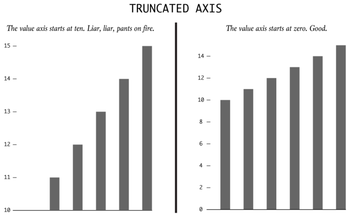
Two bar charts of values 10 and 15. A truncated axis makes the second bar appear much larger; a zero baseline preserves the correct length ratio.

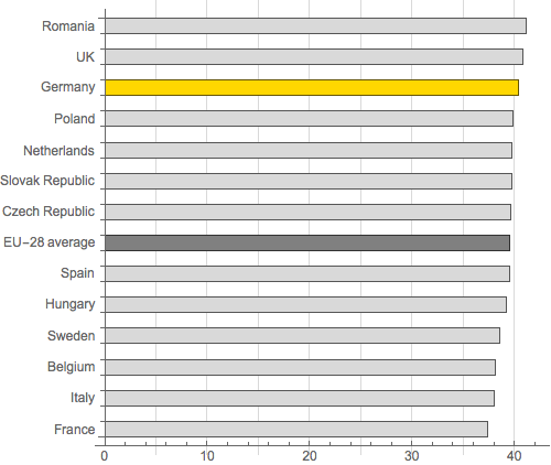
The same UK working-hours data tell two different visual stories

Published chart: axis starts at 36
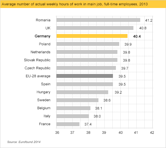
Published horizontal bar chart of weekly working hours by European country with the value axis beginning at 36 hours.

Redrawn chart: axis starts at 0

Redrawn horizontal bar chart of the same weekly working-hours data with the value axis beginning at zero.

Source: Calling Bullshit, “Misleading axes on graphs”; original chart attributed there to Germany Trade & Invest.

Line charts need not include zero

Annual average global surface temperature, 1880–2025

Source: NASA GISS, GISTEMP v4, annual global land–ocean temperature anomalies through 2025. The approximate absolute scale adds NASA’s commonly used 14°C reference mean.

Why zero matters for bars but not always for lines

Bar chart Line chart
Primary visual cue Length measured from a baseline Position and slope across an ordered axis
Typical question How large is each value? How did the value change?
Effect of omitting zero Changes the visible length ratios Can reveal change that a zero baseline would compress

Bad practice 3: Dual axes can manufacture a visual relationship

  • Each series receives an independently adjustable scale.
  • Changing either range alters where the lines cross and how closely they track.
  • Visual alignment is therefore partly a design choice, not only a property of the data.
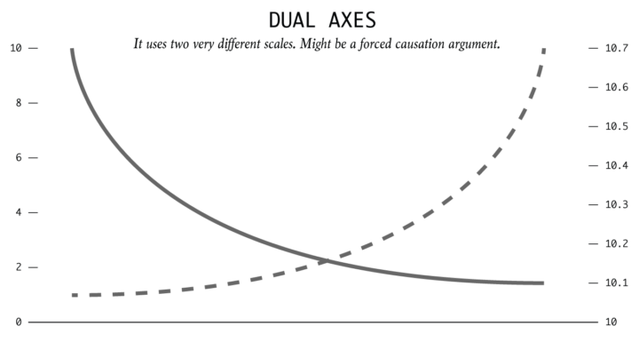
What’s wrong with this chart?
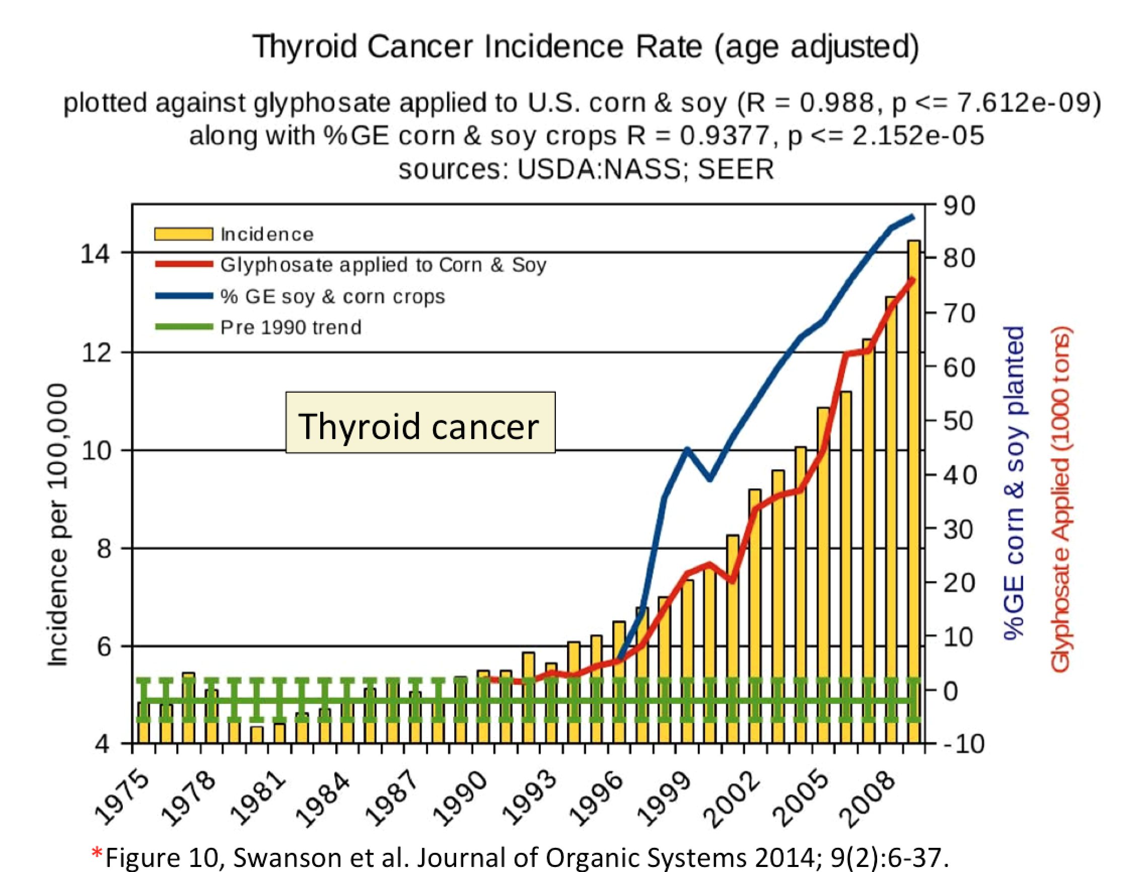
Chart overlaying thyroid cancer incidence bars with glyphosate use, genetically engineered crop adoption, and a prison population trend using multiple vertical scales.

Source: Calling Bullshit, “Misleading axes on graphs”; reproduced there from Swanson et al. (2014).

The apparent alignment depends on the chosen scales

Chart overlaying thyroid cancer incidence with several agricultural and social time series using multiple y-axes.

  • The cancer-incidence bars begin above zero.
  • The right-side scales are shifted and stretched; one extends below meaningful zero for percentages and tonnage.
  • The resulting visual alignment does not establish that one series caused the other.

Bad practice 4: Fliped y-axis
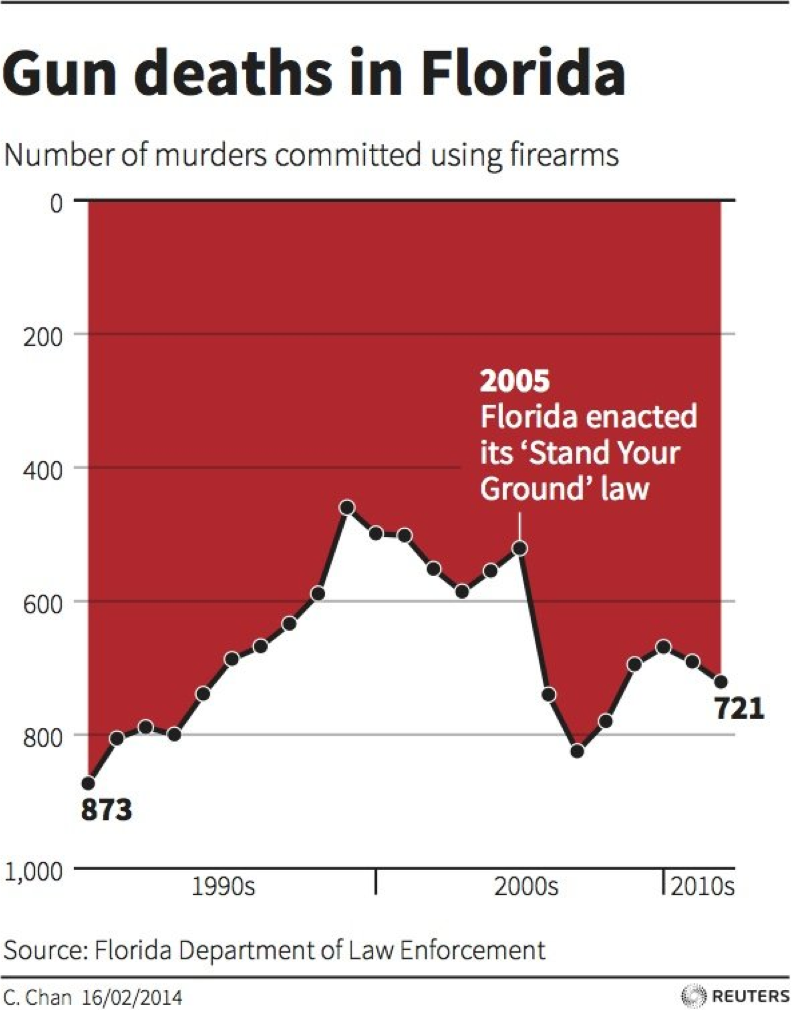
Reuters graphic of firearm murders in Florida with zero at the top of the y-axis and larger values lower on the page.

Source: Calling Bullshit, “Misleading axes on graphs”; original graphic credited there to Reuters.

Bad practice 5: Area and dimensions

Linear scaling of width and height
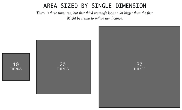
Squares labeled 10, 20, and 30 whose width and height are both scaled linearly, causing area to grow quadratically.

Equal areas with different dimensions
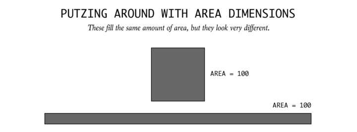
A square and a long thin rectangle, both labeled as having area 100, illustrating that shape affects perceived area.

  • When value is encoded by area, scale the area to the value. Doubling both width and height produces four times the area.
  • Even correctly scaled areas are less precise than position or length and can be affected by shape.

A “70% increase” can look like nearly three times as much

Two green battery icons labeled Previous iPad and New iPad; the new battery is drawn much wider and taller.

Source: FlowingData, “New iPad battery size is huge”; original image credited to Gizmodo.

Bad practice 6: Chartjunk

Chartjunk is Tufte’s term for visual decoration—non-data ink or redundant data ink—that “does not tell the viewer anything new.”

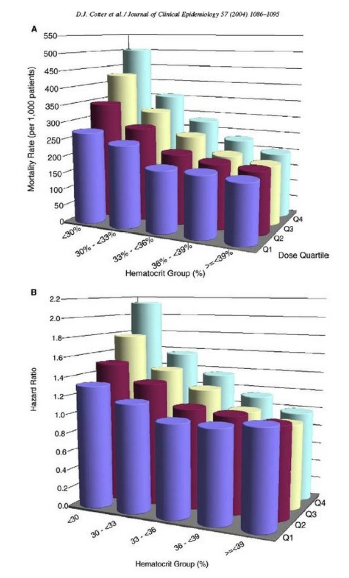
Fake perspective

3D

Two three-dimensional grouped bar charts using colored cylinders to show mortality rates and hazard ratios by hematocrit group and dose quartile.

Sources: Edward Tufte, “Chartjunk”, reproducing p. 118 of The Visual Display of Quantitative Information; Cotter et al. (2004), Journal of Clinical Epidemiology, Figure 2. PubMed

References

Yau, N. (2017). “How to Spot Visualization Lies.” FlowingData.

Yau, N. (2012). “New iPad battery size is huge.” FlowingData; image credited to Gizmodo.

Bergstrom, C. T., and West, J. D. “Misleading axes on graphs.” Calling Bullshit.

Cleveland, W. S., and McGill, R. (1984). “Graphical Perception: Theory, Experimentation, and Application to the Development of Graphical Methods.” JASA, 79(387), 531–554.

Tufte, E. R. (2015). “Chartjunk.” Reproduces material from The Visual Display of Quantitative Information.