What Is Data Visualization?
Prasanna Parasurama
Which of these count as data visualization?
A · Raw data
North region, Q1: 14
North region, Q2: 18
South region, Q1: 38
South region, Q2: 42
B · Data table
| Region | Q1 | Q2 |
|---|---|---|
| North | 14 | 18 |
| South | 38 | 42 |
C · Bar chart
D · Infographic / infovis
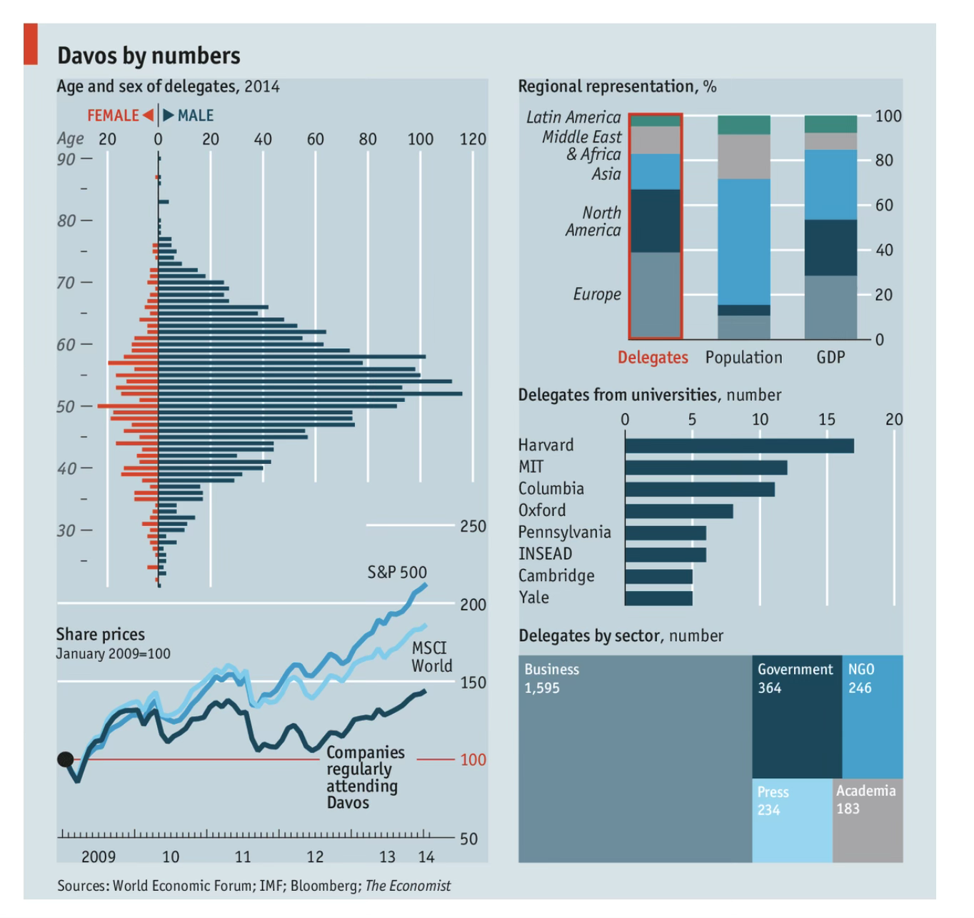
Hover or focus to enlarge
E · Dashboard
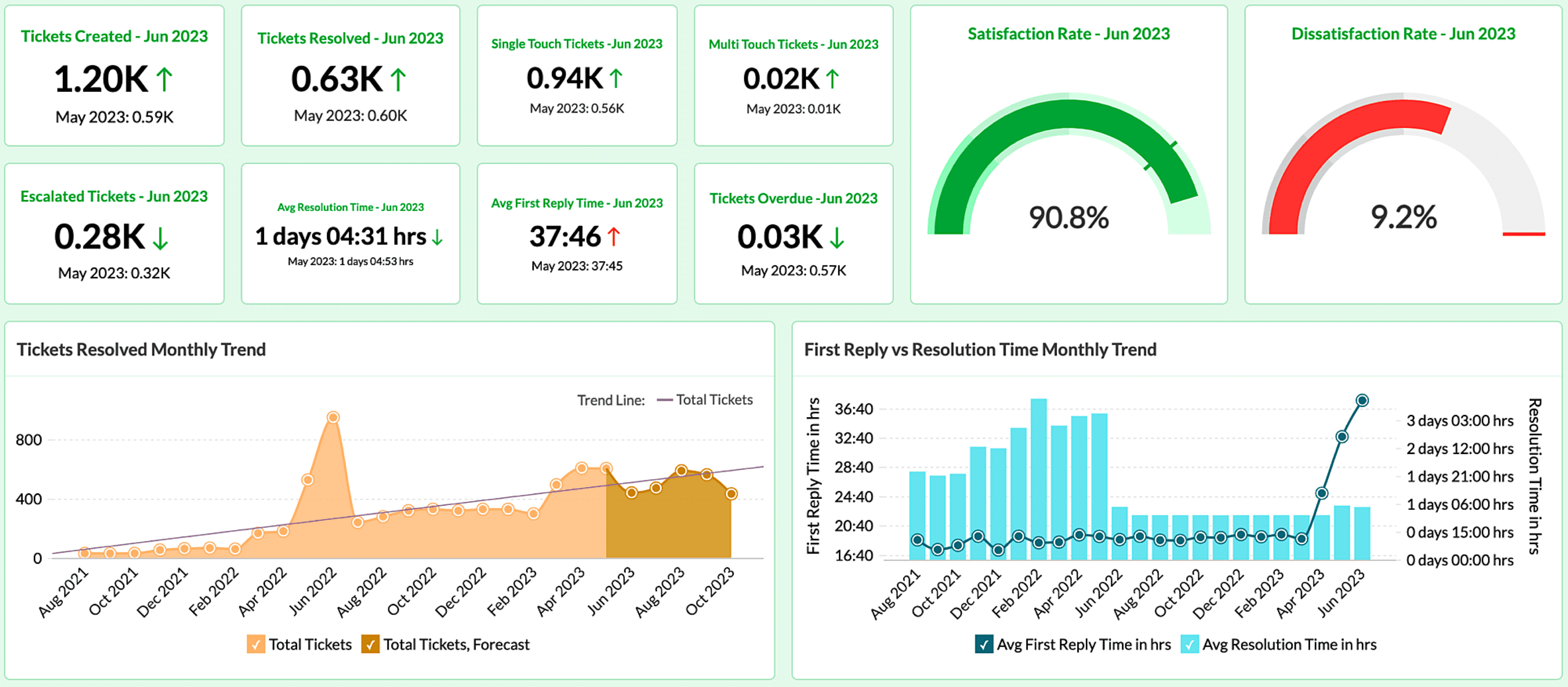
Hover or focus to enlarge
Tables, charts, infographics, and dashboards are different visualization artifacts
| Artifact | What the visual form does | Common use |
|---|---|---|
| Data table | Organizes values through rows, columns, alignment, order, and formatting | Exact lookup, reporting, reconciliation |
| Chart | Encodes values as marks and visual channels | Compare, rank, track change, find patterns |
| Infographic / information visualization | Organizes relationships or a selected message through visual structure, annotation, and sometimes interaction | Explain a system, reach a defined audience, support discovery |
| Dashboard | Combines indicators and views that are updated or revisited | Monitor status, identify exceptions, decide where to investigate |
The author’s intent places an artifact along an explore-to-explain spectrum
EXPLOREEXPLAIN
Diagnostic plot
The author is often the analyst. Alternative explanations and uncertainty remain available.
Working table
Exact values and flexible sorting support questions that are still changing.
Dashboard
Recurring users monitor measures, identify exceptions, and decide where to investigate.
Report chart
Evidence is selected for a defined audience and a known decision context.
Infographic / presentation
Evidence is annotated and sequenced for comprehension, recall, or action.
Exploration and explanation are different stages of work
| Exploratory visualization | Explanatory visualization | |
|---|---|---|
| Primary question | What patterns or problems might be present? | What should this audience understand? |
| Audience | Analyst, collaborator, subject expert | Decision-maker, client, public audience |
| Scope | Many variables, cuts, and alternative views | Selected evidence relevant to a claim |
| Annotation | Working labels and diagnostics | Context, interpretation, and sources |
| Success | Better questions and defensible next analyses | Accurate understanding of the conclusion |
What is the purpose of each chart?
- Discussion: How do color, line weight, and annotation change what you notice first?
Working definition for this course
Data visualization is the systematic representation of data through visual form to support human interpretation, analysis, or communication.
Data: measured, recorded, or derived information
Systematic representation: a rule links data to visible form
Human interpretation: the viewer decodes the representation
Purpose: analysis, communication, or both
Four steps of data visualization
| 1 · Purpose | 2 · Data | 3 · Visual encoding | 4 · Formatting / aesthetics |
|---|---|---|---|
| Why does this artifact exist, and for whom? | Which data or evidence belongs in it? What does not? | How will the data be visually encoded? | How can the encoding be made more readable and interpretable? |
| Audience · task · intended use | Data · context | Artifact type · chart form · hierarchy · interaction | Type · color · spacing · labels · line weight |
Viewer tasks translate purpose into design requirements
| Task | Question | Often useful artifacts |
|---|---|---|
| Retrieve | What is the exact value? | Table, labeled dashboard |
| Compare or contrast | Which is larger, smaller, or different? | Aligned bars, dot plot, comparison table |
| Rank | What comes first or last? | Sorted bars, ordered table |
| Track change | What changed, and when? | Line chart, small multiples |
| Discover | Are there patterns, relationships, or unusual cases? | Scatterplot, distribution, diagnostic views |
| Monitor and respond | Which measure crossed a target or needs attention? | Dashboard, control chart |
| Explain or persuade | Which conclusion should the audience assess or act on? | Annotated chart, report graphic, infographic |
- A useful artifact is designed for a task that a specified audience needs to perform.
Which visual encoding is “better”? It depends on the viewer’s task
TABLE
| Region | Sales |
|---|---|
| North | 62 |
| South | 48 |
| West | 79 |
| East | 43 |
BARS
PIE
- The data are unchanged. The visual encoding changes the viewer’s easiest judgment.
Formatting can improve readability and interpretability
- Both charts show the same revenue shares. Sorting, selective color, and direct annotation reduce search and legend lookup.
References
IBM. “What is data visualization?”
https://www.ibm.com/think/topics/data-visualization
Noah Iliinsky. “Four Pillars of Visualization.”
https://www.slideshare.net/slideshow/four-pillars-of-visualization-by-noah-iliinsky/31624577
Andrew Gelman and Antony Unwin. “Infovis and Statistical Graphics: Different Goals, Different Looks.”
https://sites.stat.columbia.edu/gelman/bayescomputation/GelmanUnwin2011.pdf
UC Davis DataLab. “Principles of Data Visualization.”
https://ucdavisdatalab.github.io/workshop_data_viz_principles/index.html
Duke University Libraries. “Data Visualization.”
https://guides.library.duke.edu/c.php?g=289678&p=1930713
UC Berkeley Library. “Data Visualization.”
https://guides.lib.berkeley.edu/data-visualization
Durham University. “Data visualization, Lecture 3.”
https://maths.dur.ac.uk/stats/MDS-DEVUL/lecture-3.html
Kieran Healy. “Look at Data,” Data Visualization: A Practical Introduction.
https://socviz.co/01-look-at-data.html
Next: perception and cognition in data visualization
- Why are some visual encodings better than others for a given task?
- Relative accuracy of position, length, angle, area, and color
- Preattentive features and visual search
- Gestalt grouping principles